You might be interested in

Today, we’re thrilled to unveil a refreshed visual design that not only mirrors our mission but also symbolizes our commitment to revolutionizing the battle against document fraud. This new visual design comes at a particularly special time, as we’re celebrating the fifth anniversary of Resistant AI this month. Catering to the needs of fraud, risk, operations, and compliance teams within the fintech and finance industry, our revamped identity showcases our dedication to seamlessly enhancing risk and fraud controls.
Our team has been hard at work reimagining the way Resistant AI is presented to the world. Throughout this process, we’ve made a concerted effort to create a brand character that reflects our core values of excellence in security and machine learning, trustworthiness, and helpfulness.
In an initial workshop, we delved into the connotations that Resistant AI aims to communicate through its visuals. Through the outputs of the workshop, we narrowed things down to four values that we’d like our new brand to embody:
Boldness: We take a bold approach to combating fraud and financial crime, ensuring that we remain a step ahead of criminals.
Expertise: Our team of experts is dedicated to providing top-notch solutions to safeguard the financial industry from ever-evolving methods of financial crime.
Consistency: We maintain consistency in our efforts, ensuring that our solutions are reliable and effective.
High energy: Our energetic approach to work is what keeps us motivated. We stay curious and are constantly learning in order to find new ways to tackle document fraud and financial crime.
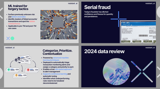
Our design language draws inspiration from the language we use in our daily lives as data scientists: it evokes classification, clustering analytics, and data visualization. We’ve put a focus on the intricate connection of two elements: circles (which represent individual information) and cross marks (signifying search and analytics).
The dynamic interplay of red and green dots within our design concept illustrates our visual identity’s essence. We’ve designed the signature cross mark to be seamlessly integrated with photos and illustrations, which allows us to maintain a non-intrusive yet impactful aesthetic.


Our redesigned logotype features a lowercase font to convey the approachable vibe that Resistant AI embraces. The cross mark is the visual element at the core of our new logo’s design. In addition to symbolizing search and analytics, the cross mark also cleverly replaces the traditional dot in ‘resistant.ai’.

Our color palette is anchored in a dark blue base and is complemented by three additional colors for use in text and illustrations. To draw attention to specific elements, we've incorporated three secondary colors—red, green, and orange. Our chosen typeface, Inter, is carefully crafted and designed for computer screens, which ensures the readability and modern appearance of our materials.


The flexibility and simplicity of our design language enable its seamless integration into various brand materials. Our design’s shapes can be combined with other pictograms, creating a consistent and recognizable identity across different mediums. To further integrate our design language into the look and feel of our imagery, we’ve crafted images using a raster that’s created directly from our brand shapes. These images you will see featured on the Resistant AI blog.
Moreover, the high variability and simplicity of our shapes allow for further use of our design language in all brand materials across the company. Our visual style is prepared to use with either a dark (blue) or light (gray) background, or a combination of both.


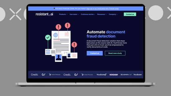
Our web redesign incorporates our primary colors and features illustrations that use our fundamental visual elements in combination with an array of signs and text.
Our enhanced web presence ensures a cohesive online presence, reinforcing our commitment to staying at the forefront of detecting fraudulent documents and criminal transactions automatically with AI. As the digital world continues to evolve, our brand is prepared to adapt and stay one step ahead in the ever-changing financial crime landscape.

As we embrace this new phase in our journey, we remain committed to supporting our customers and partners in the fight against advanced fraud and financial crime. Through both our innovative solutions and our visually impactful brand, we’re here to safeguard the financial industry with unparalleled dedication and resilience.


